Bottom Navigation Bar in Android Jetpack Compose
Last Updated :
04 Mar, 2025
We all have seen BottomNavigationBar in so many apps, such as Instagram, Quora. In this article, we will learn how to add bottom navigation in Jetpack Compose. Below is a sample of how it will look.

Why do we need a Bottom Navigation Bar?
- It allows the user to switch to different activities/fragments easily.
- It makes the user aware of the different screens available in the app.
- The user is able to check which screen are they on at the moment.
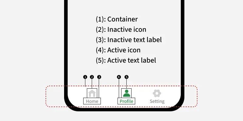
Anatomy diagram for the Bottom Navigation Bar:
Prerequisites:
Step by Step Implementation
Step 1: Create a New Project (Or use it in the existing Compose project)
To create a new project in the Android Studio, please refer to How to Create a new Project in Android Studio with Jetpack Compose.
Note: Select Kotlin as the programming language.
Step 2: Adding Dependencies
Open build.gradle.kts (Module: app) and add the following dependency.
implementation("androidx.navigation:navigation-compose:2.8.8")
Step 3: Create a Bottom Nav Items model class
Let's create a data class to hold data related to bottom nav items like label, icon, route. Navigate to app > {package-name} and right click on the folder, then go to New > Package. Create a new package with the name "models". Then right click on models folder and select New > Kotlin Class/File. Set the name as "BottomNavItem", select Data class and the add the following code the file.
BottomNavItem.kt:
Kotlin
package com.geeksforgeeks.demo.models

import androidx.compose.ui.graphics.vector.ImageVector

data class BottomNavItem(
    // Text below icon
    val label: String,
    // Icon
    val icon: ImageVector,
    // Route to the specific screen
    val route:String,
)
Step 4: Create a List of Bottom Nav Items in an Object
Let's create a objectto define data related to separate bottom nav items like label, icon, and route. Navigate to app > {package-name} and right click on the folder, then go to New > Package. Create a new package with the name "utils". Then right click on utils folder and select New > Kotlin Class/File. Set the name as "Constants", select Object and the add the following code the file.
Constants.kt:
Kotlin
package com.geeksforgeeks.demo.utils

import androidx.compose.material.icons.Icons
import androidx.compose.material.icons.filled.*
import com.geeksforgeeks.demo.models.BottomNavItem

object Constants {
    val BottomNavItems = listOf(
        // Home screen
        BottomNavItem(
            label = "Home",
            icon = Icons.Filled.Home,
            route = "home"
        ),
        // Search screen
        BottomNavItem(
            label = "Search",
            icon = Icons.Filled.Search,
            route = "search"
        ),
        // Profile screen
        BottomNavItem(
            label = "Profile",
            icon = Icons.Filled.Person,
            route = "profile"
        )
    )
}
Step 5: Create screens for different Nav Items
Let's create three Composables to store the UI for three screens - Home, Search and Profile. Navigate to app > {package-name} > ui and right click on the folder, then go to New > Package. Create a new package with the name "components". Then right click on components folder and select New > Kotlin Class/File. Set the name as "Screens", select File and the add the following code the file.
Screens.kt:
Kotlin
package com.geeksforgeeks.demo.ui.components

import androidx.compose.foundation.background
import androidx.compose.foundation.layout.Arrangement
import androidx.compose.foundation.layout.Column
import androidx.compose.foundation.layout.fillMaxSize
import androidx.compose.material.icons.Icons
import androidx.compose.material.icons.filled.Home
import androidx.compose.material.icons.filled.Person
import androidx.compose.material.icons.filled.Search
import androidx.compose.material3.Icon
import androidx.compose.material3.Text
import androidx.compose.runtime.Composable
import androidx.compose.ui.Alignment
import androidx.compose.ui.Modifier
import androidx.compose.ui.graphics.Color

@Composable
fun HomeScreen() {
    Column(
        modifier = Modifier
            .fillMaxSize()
            .background(Color.White),
        horizontalAlignment = Alignment.CenterHorizontally,
        verticalArrangement = Arrangement.Center
    ) {
        // Icon on the screen
        Icon(
            imageVector = Icons.Default.Home,
            contentDescription = "home",
            tint = Color(0xFF0F9D58)
        )
        // Text on the screen
        Text(text = "Home", color = Color.Black)
    }
}

@Composable
fun SearchScreen() {
    Column(
        modifier = Modifier
            .fillMaxSize()
            .background(Color.White),
        horizontalAlignment = Alignment.CenterHorizontally,
        verticalArrangement = Arrangement.Center
    ) {
        // Icon on the screen
        Icon(
            imageVector = Icons.Default.Search,
            contentDescription = "search",
            tint = Color(0xFF0F9D58)
        )
        // Text on the screen
        Text(text = "Search", color = Color.Black)
    }
}

@Composable
fun ProfileScreen() {
    Column(
        modifier = Modifier
            .fillMaxSize()
            .background(Color.White),
        horizontalAlignment = Alignment.CenterHorizontally,
        verticalArrangement = Arrangement.Center
    ) {
        // Icon on the screen
        Icon(
            imageVector = Icons.Default.Person,
            contentDescription = "Profile",
            tint = Color(0xFF0F9D58)
        )
        // Text on the screen
        Text(text = "Profile", color = Color.Black)
    }
}
Step 6: Working with the MainActivity
Navigate to app> kotlin+java> {package-name} > MainActivity.kt. Here, we will be creating two composables with the name NavHostContainer() and BottomNavigationBar() in MainActivity.kt which will contain NavHost and the Composable for navigation and the setup for the Navigation Bar. Add the following code in MainActivity.kt. Comments are added for better understanding.
MainActivity.kt:
Kotlin
package com.geeksforgeeks.demo

import android.os.Bundle
import androidx.activity.*
import androidx.activity.compose.setContent
import androidx.compose.foundation.layout.*
import androidx.compose.material3.*
import androidx.compose.runtime.*
import androidx.compose.ui.*
import androidx.compose.ui.graphics.*
import androidx.navigation.NavHostController
import androidx.navigation.compose.NavHost
import androidx.navigation.compose.composable
import androidx.navigation.compose.currentBackStackEntryAsState
import androidx.navigation.compose.rememberNavController
import com.geeksforgeeks.demo.ui.components.HomeScreen
import com.geeksforgeeks.demo.ui.components.ProfileScreen
import com.geeksforgeeks.demo.ui.components.SearchScreen
import com.geeksforgeeks.demo.ui.theme.DemoTheme
import com.geeksforgeeks.demo.utils.Constants

class MainActivity : ComponentActivity() {
    override fun onCreate(savedInstanceState: Bundle?) {
        super.onCreate(savedInstanceState)
        enableEdgeToEdge()
        setContent {
            DemoTheme(dynamicColor = false, darkTheme = false) {
                val navController = rememberNavController()
                Surface(color = Color.White) {
                    // Scaffold Component
                    Scaffold(
                        // Bottom navigation
                        bottomBar = {
                            BottomNavigationBar(navController = navController)
                        }, content = { padding ->
                            // Nav host: where screens are placed
                            NavHostContainer(navController = navController, padding = padding)
                        }
                    )
                }
            }
        }
    }
}

@Composable
fun NavHostContainer(
    navController: NavHostController,
    padding: PaddingValues
) {

    NavHost(
        navController = navController,

        // set the start destination as home
        startDestination = "home",

        // Set the padding provided by scaffold
        modifier = Modifier.padding(paddingValues = padding),

        builder = {

            // route : Home
            composable("home") {
                HomeScreen()
            }

            // route : search
            composable("search") {
                SearchScreen()
            }

            // route : profile
            composable("profile") {
                ProfileScreen()
            }
        })
}

@Composable
fun BottomNavigationBar(navController: NavHostController) {

    NavigationBar(

        // set background color
        containerColor = Color(0xFF0F9D58)) {

        // observe the backstack
        val navBackStackEntry by navController.currentBackStackEntryAsState()

        // observe current route to change the icon
        // color,label color when navigated
        val currentRoute = navBackStackEntry?.destination?.route

        // Bottom nav items we declared
        Constants.BottomNavItems.forEach { navItem ->

            // Place the bottom nav items
            NavigationBarItem(

                // it currentRoute is equal then its selected route
                selected = currentRoute == navItem.route,

                // navigate on click
                onClick = {
                    navController.navigate(navItem.route)
                },

                // Icon of navItem
                icon = {
                    Icon(imageVector = navItem.icon, contentDescription = navItem.label)
                },

                // label
                label = {
                    Text(text = navItem.label)
                },
                alwaysShowLabel = false,

                colors = NavigationBarItemDefaults.colors(
                    selectedIconColor = Color.White, // Icon color when selected
                    unselectedIconColor = Color.White, // Icon color when not selected
                    selectedTextColor = Color.White, // Label color when selected
                    indicatorColor = Color(0xFF195334) // Highlight color for selected item
                )
            )
        }
    }
}
Output:
Similar Reads
Jetpack Navigation Component in Android
The Navigation Architecture Component simplifies navigation implementation while also assisting you in visualizing your app's navigation flow. The library offers a variety of advantages, including: Handling of fragment transactions automaticallyBy default, up and back actions are handled correctly.D
5 min read
Bottom Navigation Bar in Android
We all have come across apps that have a Bottom Navigation Bar. Some popular examples include Instagram, WhatsApp, etc. In this article, let's learn how to implement such a functional Bottom Navigation Bar in the Android app. Why do we need a Bottom Navigation Bar? It allows the user to switch to di
6 min read
Button in Android using Jetpack Compose
Jetpack Compose is a new toolkit provided by Google. This is useful for designing beautiful UI designs. A Button is a UI component in Android which is used to navigate between different screens. With the help of a button, the user can interact with your app and perform multiple actions inside your a
3 min read
Motion Layout Button in Android Jetpack Compose
Motion Layout is a special version of Constraint layout. With the help of motion layout, we can add animations to the widgets within the layout and change the position of that widget dynamically. In this article, we will take a look at How to implement Motion Layout animation on buttons in Android u
8 min read
Switch Button in Android using Jetpack Compose
A Switch or a Switch Button in Android is a UI element that is used to switch between two states upon click. It can be assumed as a Boolean button with two different values. Some states where you may find a Switch in your Android device can be WIFI ON and OFF, Bluetooth ON and OFF, Dark Mode and Lig
3 min read
Pie Chart in Android using Jetpack Compose
Pie Charts are used in many Android applications to display a huge quantity of data in a simple and easy format. This is seen in applications where a huge quantity of data is to be handled. In this article, we will take a look at How to Create a Pie Chart in Android using Jetpack Compose. A sample v
8 min read
Chip Bottom Navigation Bar in Android with Kotlin
We all know various apps that have a Bottom Navigation Bar. Some famous examples include Snapchat, Linkedin, Gmail, etc. In this article, let’s learn how to implement Chip Navigation Bottom Bar in Android apps using Kotlin. This Chip navigation is a mix of Bottom Navigation with Chip components. Als
3 min read
Sliding Bottom Sheet in Android using Jetpack Compose
Bottom Sheet is a material design component that slides up from the bottom of the screen to display additional content for the application. It is like a message that is invoked or appears upon user actions. A Bottom Sheet is widely used in modern applications. For example, a Bottom Sheet appears ins
3 min read
Android Jetpack Compose - Implement Navigation Drawer
Jetpack Compose is a new UI toolkit from Google used to create native Android UI. It speeds up and simplifies UI development using less code, Kotlin APIs, and powerful tools. Prerequisites Familiar with Kotlin and OOP ConceptsBasic understanding of Jetpack ComposeThe navigation drawer is the most us
3 min read
Basics of Jetpack Compose in Android
Jetpack Compose is a modern UI toolkit that is designed to simplify UI development in Android. It consists of a reactive programming model with conciseness and ease of Kotlin programming language. It is fully declarative so that you can describe your UI by calling some series of functions that will
5 min read